 2025
2025
Take your listening worldwide
In this project we were asked to design a three-screen music app interface consisting of a Dashboard, Playlist and Track screen. It was important that our app demonstrated clear user flow, visual consistency, and a strong conceptual foundation.
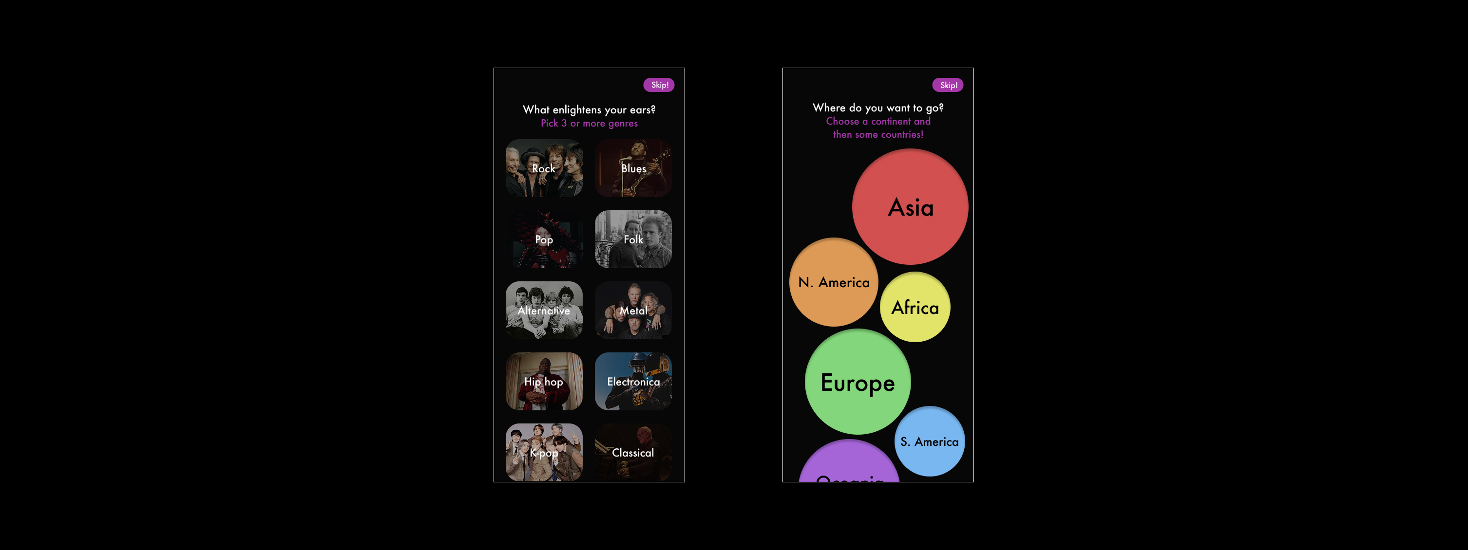
Before designing, I wanted to explore how people use music apps and which features matter most to them. After speaking to a few friends, I found that while they appreciated personalised suggestions, they often struggle to find new or international artists naturally. This insight inspired features like a map-based dashboard and genre filters.
As a Spotify user, I used it as my main reference point. Studying its layout helped me understand what works well and what could be improved. I love how Spotify highlights recently listened albums while keeping a clean interface. However, the 'Discover Weekly' feature, alongside some others, feel too hidden which gave me the opportunity for clearer content discovery on my own design.
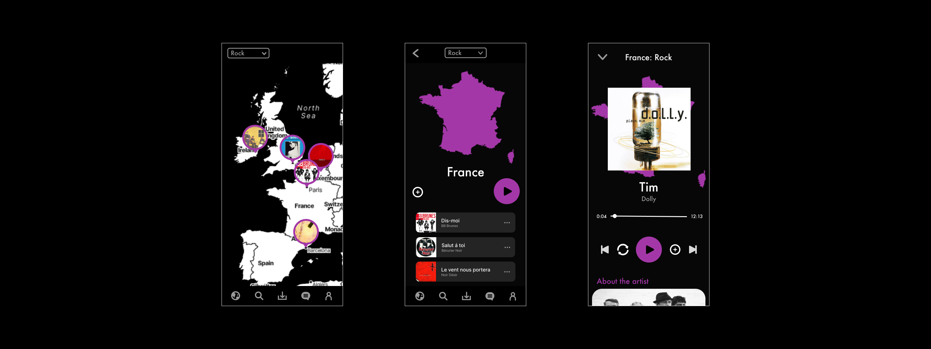
My idea was to create a music app called 'Tunea', which lets users explore music from around the world through an interactive map. Instead of a traditional scrolling dashboard, the user can navigate a world map and discover what is popular in different countries. There's an additional feature where you can filter by genre, so the playlists update depending on what kind of music you're in the mood for.
I created the name 'Tunea' by combining the words 'Tune' and 'Pangea', to hint more at music bringing people together across the world.

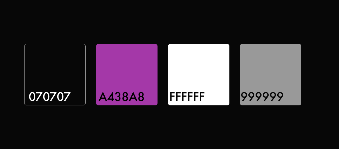
I switched out my original green and blue palette for an electric purple and black theme as it felt more energetic and had better contrast against a dark black.
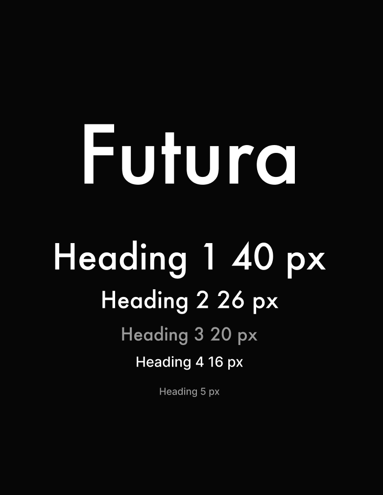
I went with Futura for its clean, geometric style. It has great readability and keeps everything looking sharp.
I started with some quick sketches of the 3 UI screens to have a visual understanding of my design.
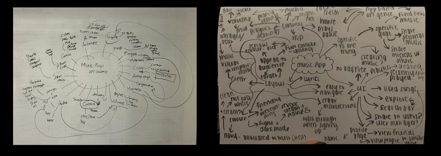
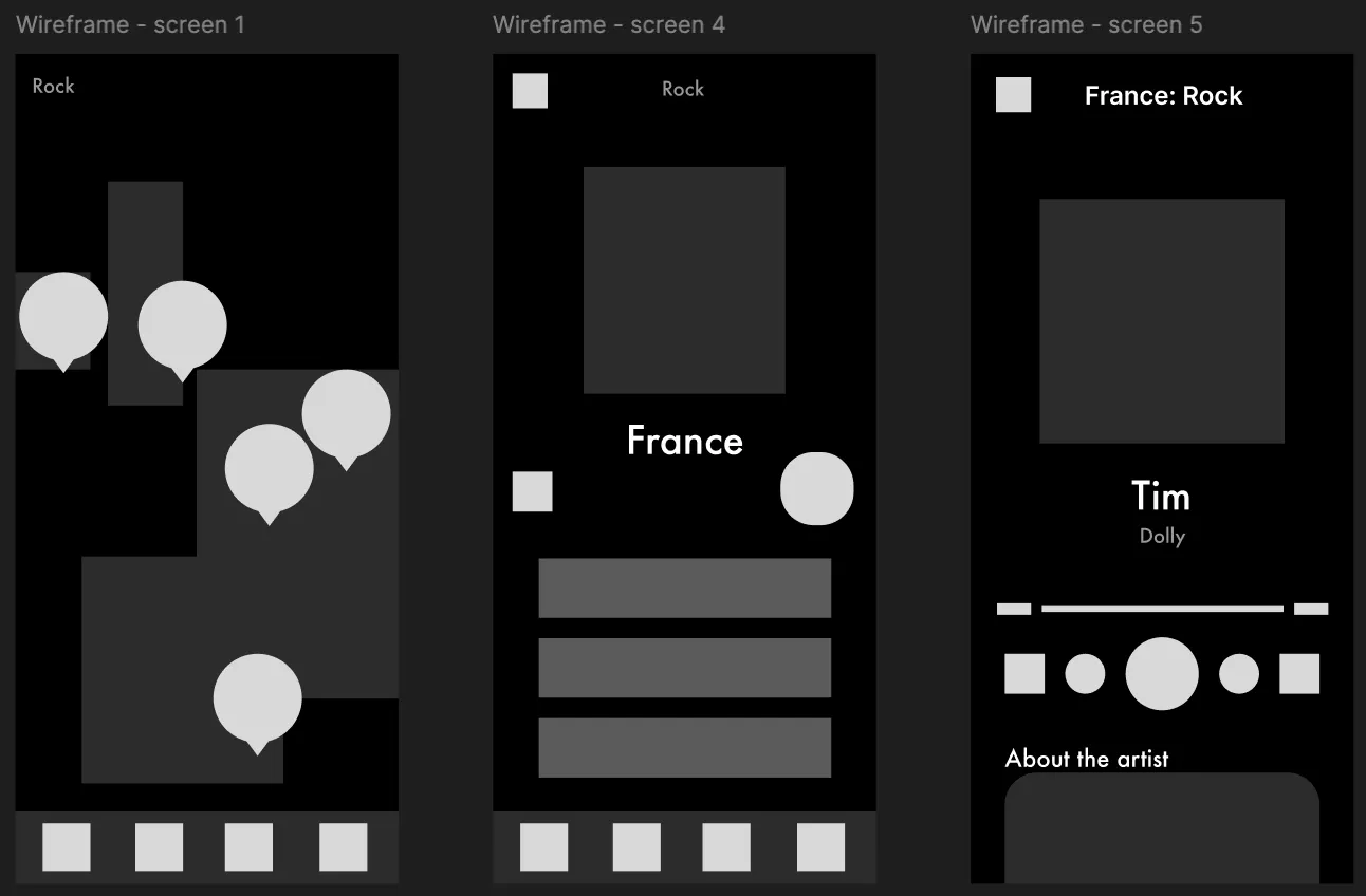
After completing my sketches, I made some rough wireframes to shape my design into the screen size I am working with.
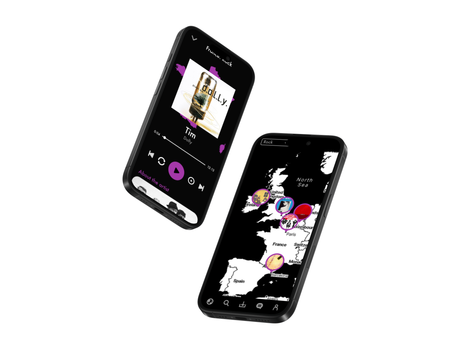
Yay, it's finished!
The final design is a sleek, modern interface that highlights discovery and simplicity. The interactive map makes browsing playful and unique, while the playlist and track screens keep the experience clean and intuitive. The purple accents bring energy and contrast to the dark layout, giving the app its own distinct identity.
I made another 2 frames, just to add more depth to the design.