 2024
2024
Saving hard? Or hardly saving?
The goal was to design a digital banking brand for 16–25 year olds that feels approachable, modern, and accessible. The brand needed to build trust while keeping a friendly and engaging tone for young users.
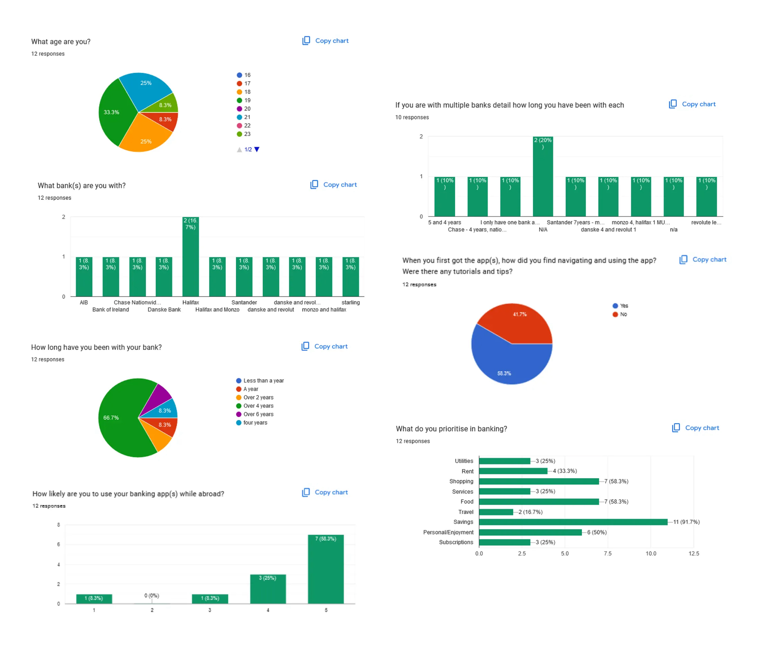
I began my user research by comparing traditional and digital banks to understand how users interact with each. Through surveys and interviews with strangers in our environment, we found that young people prioritise clear navigation, strong visuals and overall efficiency in their banking experience.
I began by gathering insights from smartwatch users about their favourite and least-used features, as well as improvements they would make. This provided useful context on how people actually use their devices.
"From my research, I established five key values: Friendly, Helpful, Secure, Opportunistic, and Accessible. These guided the brand's tone, visuals, and user experience — aiming to make banking feel supportive and empowering rather than intimidating."
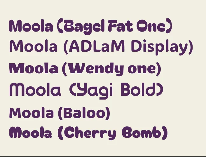
I brainstormed several name options and tested them with peers. Moola was chosen for its fun, memorable link to money and its relaxed, youthful tone that suited the brand's personality.
I explored a range of rounded, approachable typefaces and selected Yagi Bold. Its smooth, geometric forms strike the right balance between playful and professional, making it versatile across both digital and print applications.
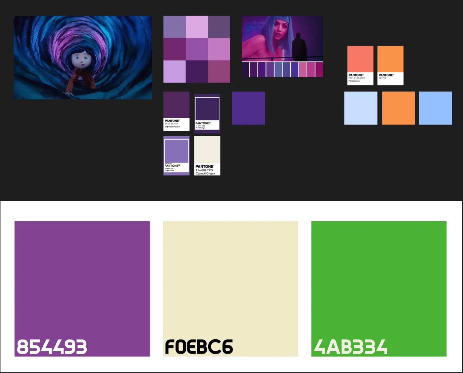
To stand out from typical banking colours, I chose a warm purple to represent creativity and confidence, paired with off-white for clarity and a lime green accent for vibrancy. The combination feels modern and youthful, matching the target audience.
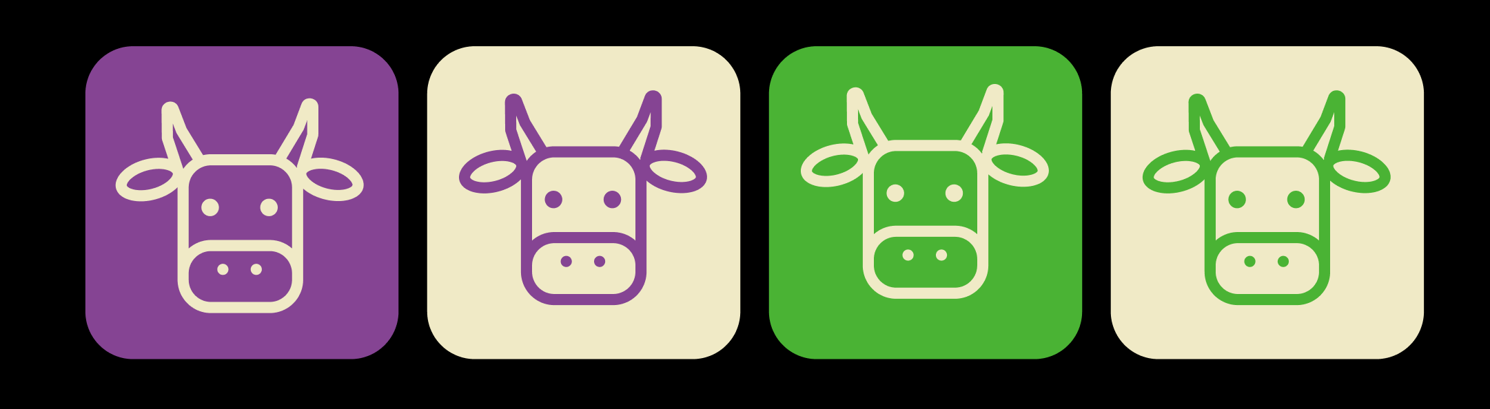
Inspired by the name "Moola," I designed a Highland cow logomark ("moo-la"). Simplifying it into clean geometric shapes created a friendly, distinctive icon that works effectively as an app symbol and brand identifier.
Yay, it's finished!
Moola is a confident, inclusive brand that transforms banking into an approachable and engaging experience for young adults. It reflects financial independence with energy, clarity, and personality.
After completing our brand our further projects were to expand on this brand, with an App Interface and Landing Page; both of which are linked below!
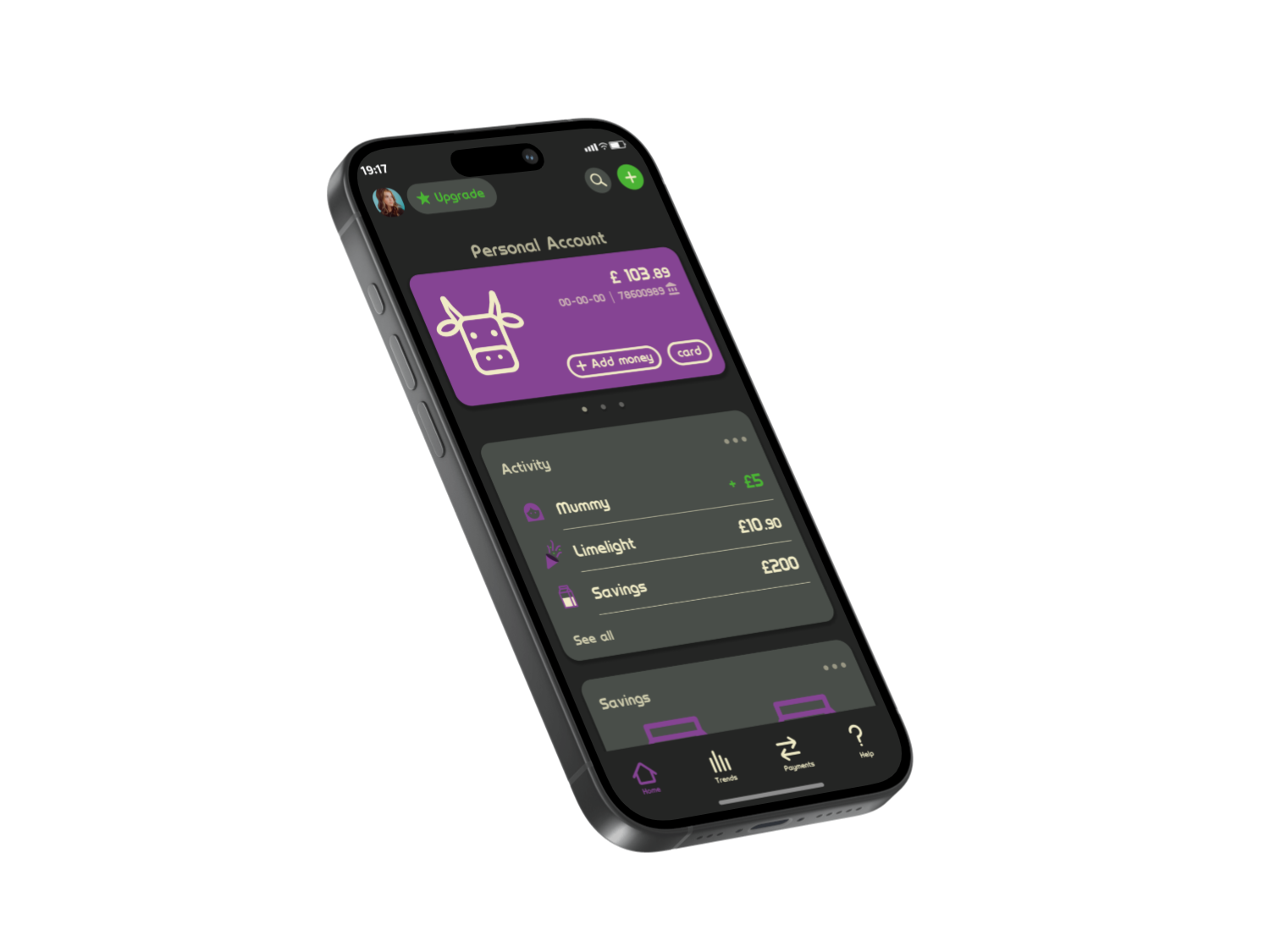
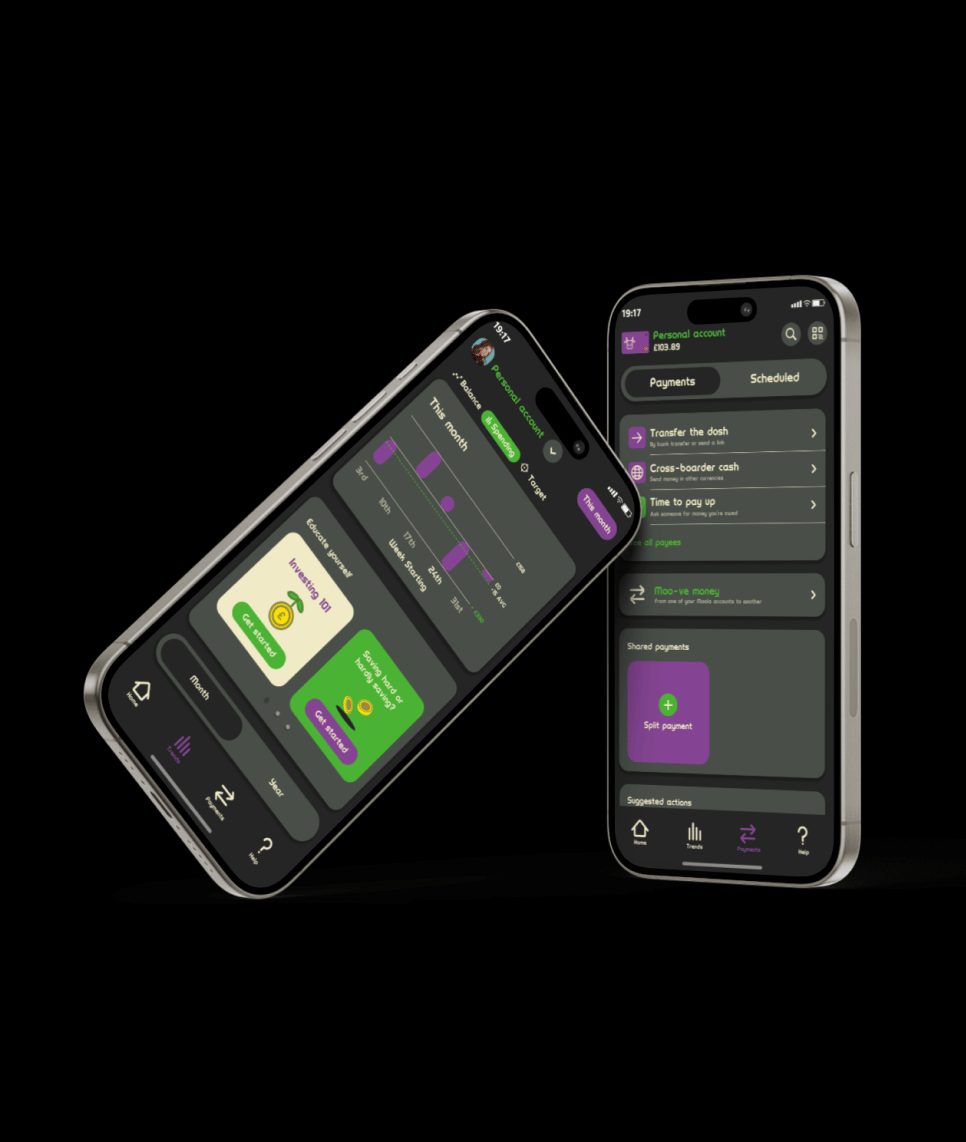
In addition to this, I created banking app for my new brand. Instead of creating one from scratch, I chose to redesign the UI of Monzo, a banking app I personally use and admire. This allowed me to focus on applying Moola's identity to an already successful user experience.
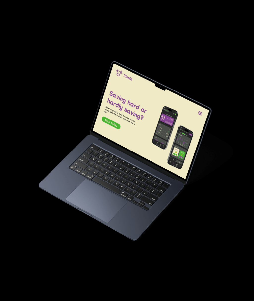
I designed a clean, modern landing page for 'Moola', taking inspiration from top companies in the industry like Revolut, Monzo and Wise. Using their design principles, I created a cohesive Figma layout that reflects my brand's colour and tone while keeping the page structured and user-friendly.
I'm proud with how my brand development turned out. I was nervous when first starting out on this project because I had never done any form of branding before, so now that I've finished this development I'm quite happy with how it turned out. I loved experimenting with different colours and icons, as frustrating as it was, the outcome was so rewarding.