 2025
2025
Learn how to talk with your hands on your wrist
For this project we were tasked with creating an application for a smart watch device. The only requirement was that it had a minimum of 3 screens.
I began by gathering insights from smartwatch users about their favourite and least-used features, as well as improvements they would make. This provided useful context on how people actually use their devices.
Competitor analysis of existing smartwatch apps shows a clear trade-off between feature-rich experiences and usability on small screens. Successful apps prioritise glanceable information, minimal navigation, and context-aware interactions, while more complex apps risk overwhelming users with excessive taps and dense interfaces.
Users shared that it is hard to tap accurately on such a small screen, that its easy to mis-tap and trigger the wrong function.
It was also reported that some users find it hard to read some smartwatch UI at a quick glance if fonts or UI spacing are too small.
There's a theory that people read in an F-shaped pattern, and that this should influence how you structure content on your website.
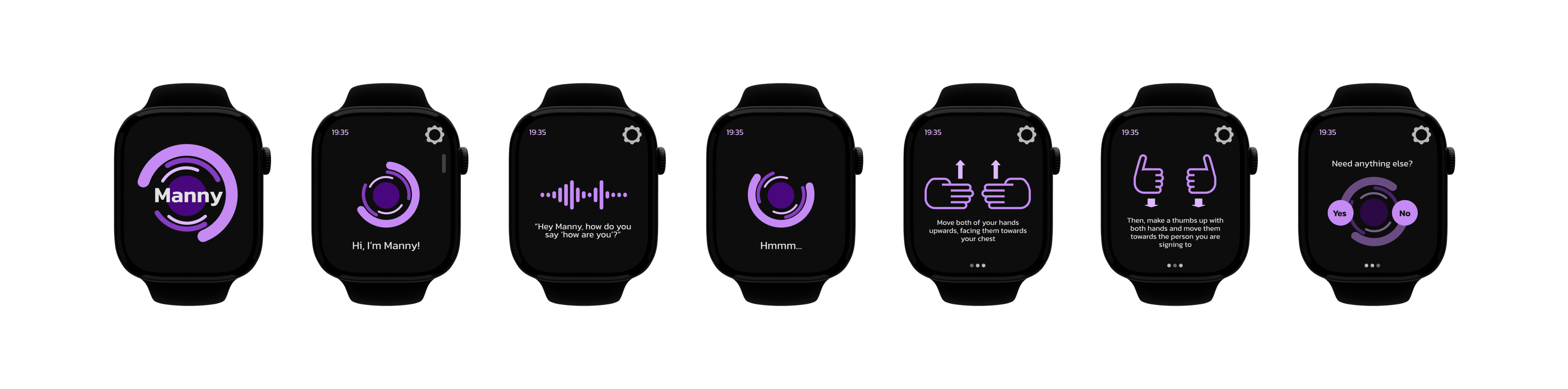
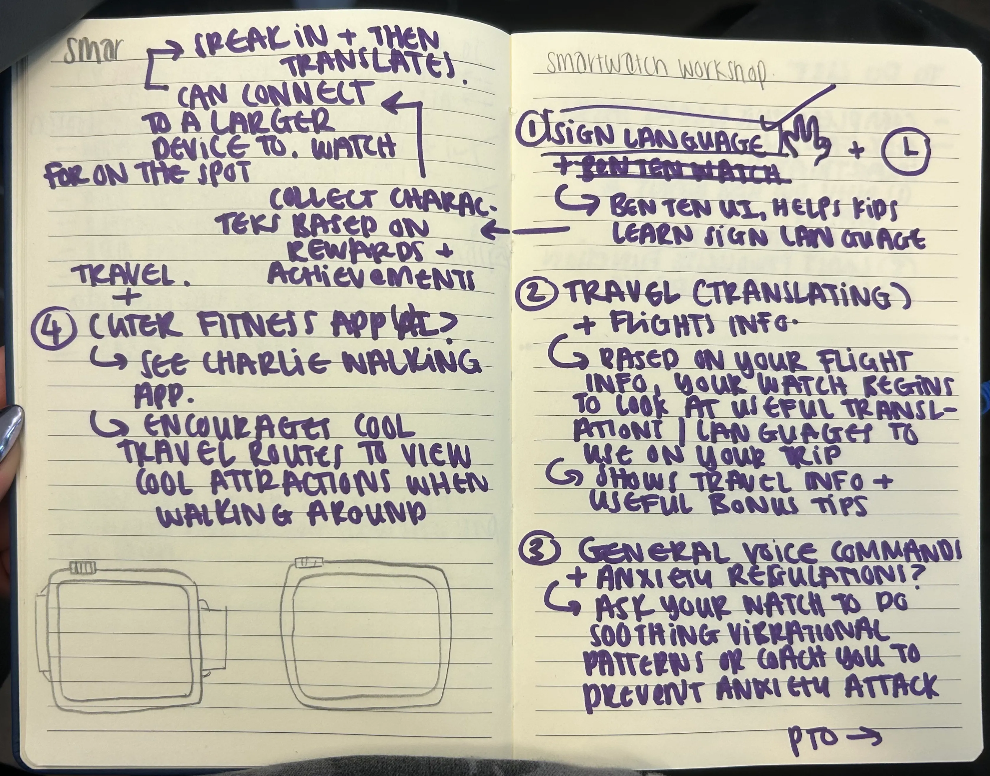
My ideation started with a workshop where we brainstormed smartwatch concepts by combining different ideas and themes. I was drawn to communication and accessibility, which led to my concept for Manny, a sign language translator that displays visual gestures directly on the watch. The idea initially targeted children but evolved to suit a wider audience while keeping a fun and approachable tone. Early sketches explored how to balance text and hand icons without overcrowding the limited screen space.
I wanted to consider names related to sign language, so after some brainstorming I landed on 'Manny' - short for 'Manual Language'.
I considered fonts like Montserrat and Avenir before choosing Kanit. I like its modern style alongside the strong legibility at small sizes.
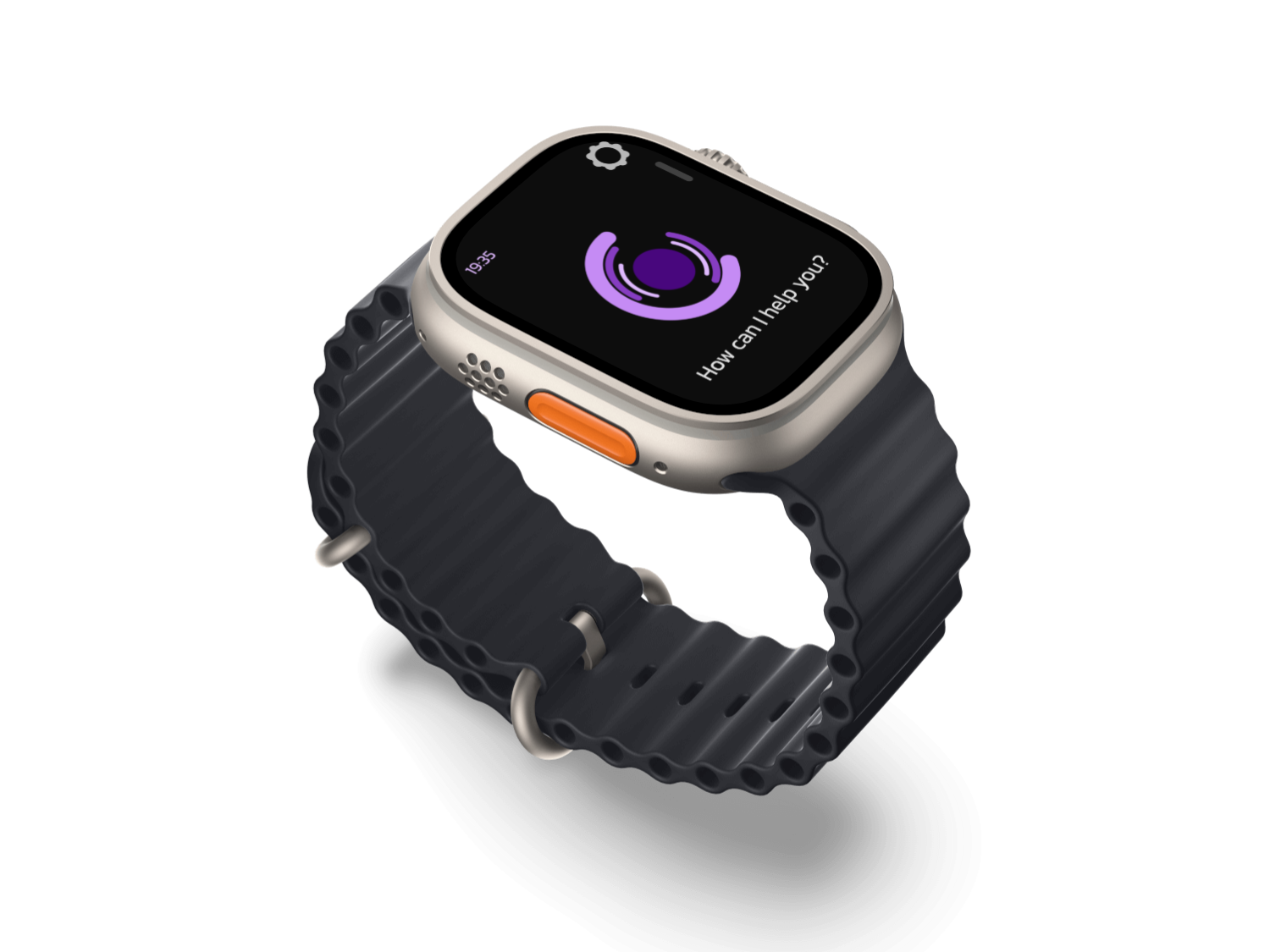
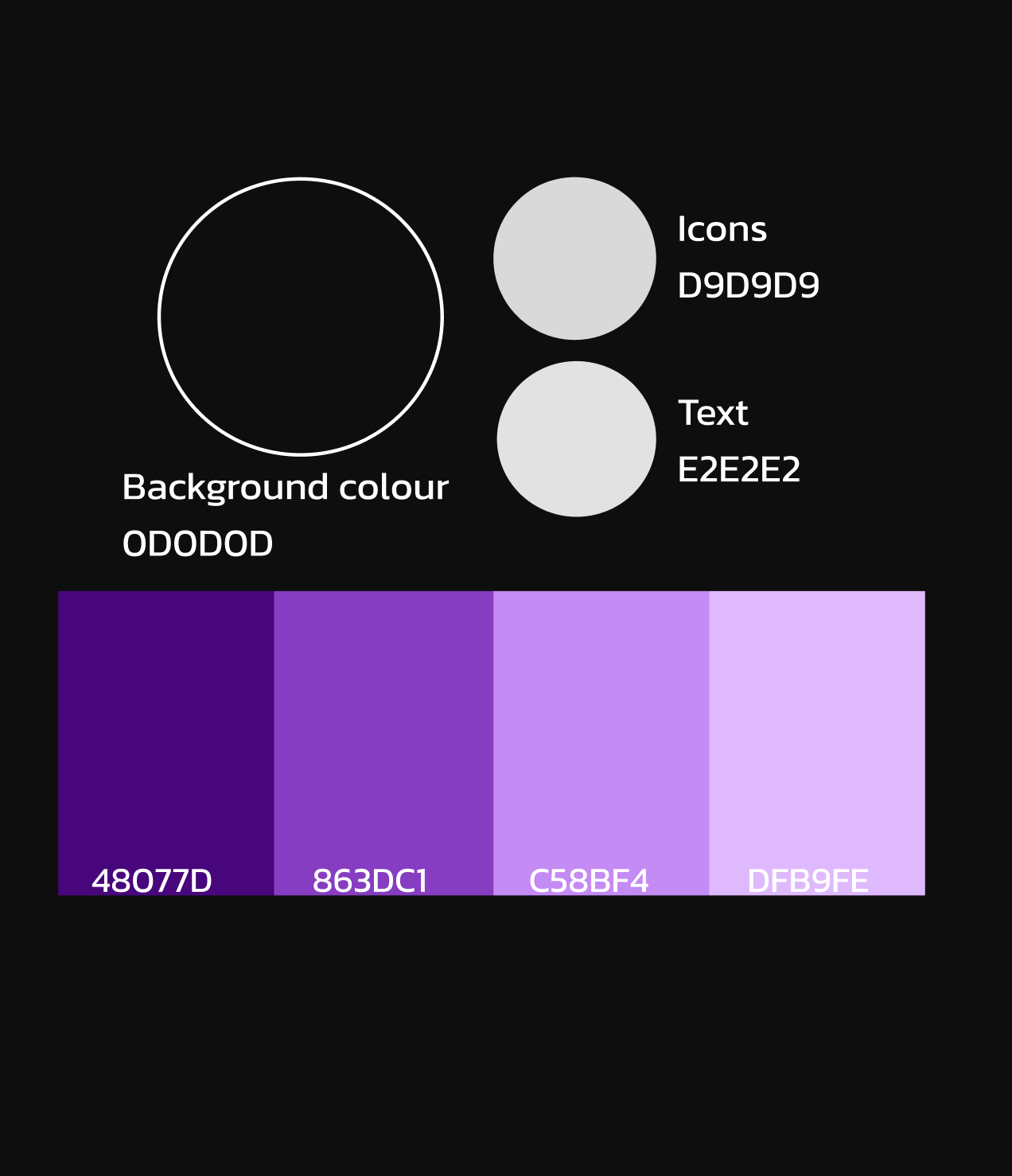
I chose a black background with a hierarchy of electric purple for strong contrast and a modern, electric feel.
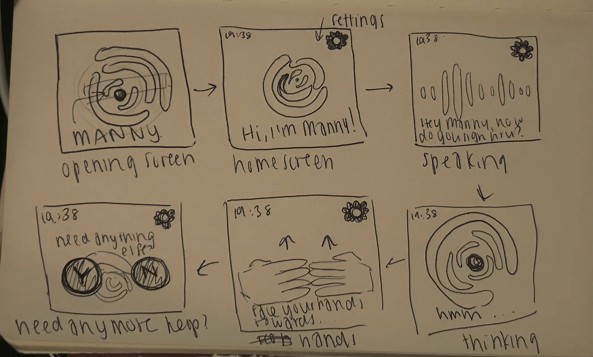
I began with rough sketches that explored the layout, ensuring a balance between text and hand icons without overcrowding the small interface. The focus was on clarity and guiding the user through each step of the translation process.
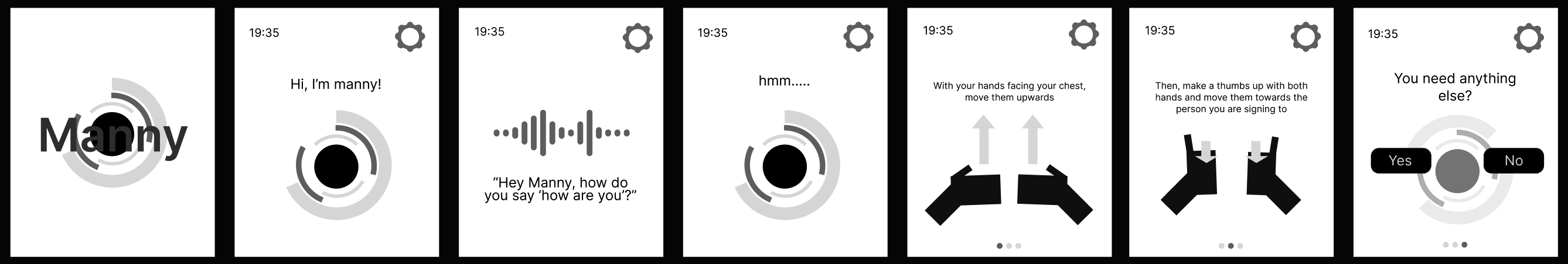
Using Figma, I digitised my sketches into low-fidelity wireframes, experimenting with screen transitions and button placement. I later refined the design to include animations for signing phrases like "How are you?", testing the usability and pacing of each sequence.
Yay, it's finished!
The final design for Manny presents a clean and intuitive smartwatch interface that teaches sign language through clear visuals and subtle motion. Its approachable typography, bold colour palette, and simple branding make it both engaging and accessible. The project successfully combines inclusive design and modern technology, showcasing how wearable interfaces can support communication and learning in meaningful ways.